
HyperionTransit
As a mobility advisor in the Mayor’s Office of Bogotá, Colombia, I co-led a study to prioritize infrastructure investments in the city’s renowned Bus Rapid Transit system, Transmilenio. Drawing on queing theory, I developed a framework to identify interventions based on interactions between various types of congestion.
Recognizing that both demand and supply are constantly in flux for most transit systems, I created HyperionTransit, an app to automatically calculate congestion indicators and plan new routes and infrastructure using GTFS, demand matrices and Emme model outputs.
Features
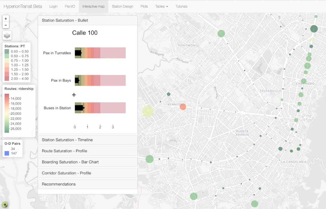
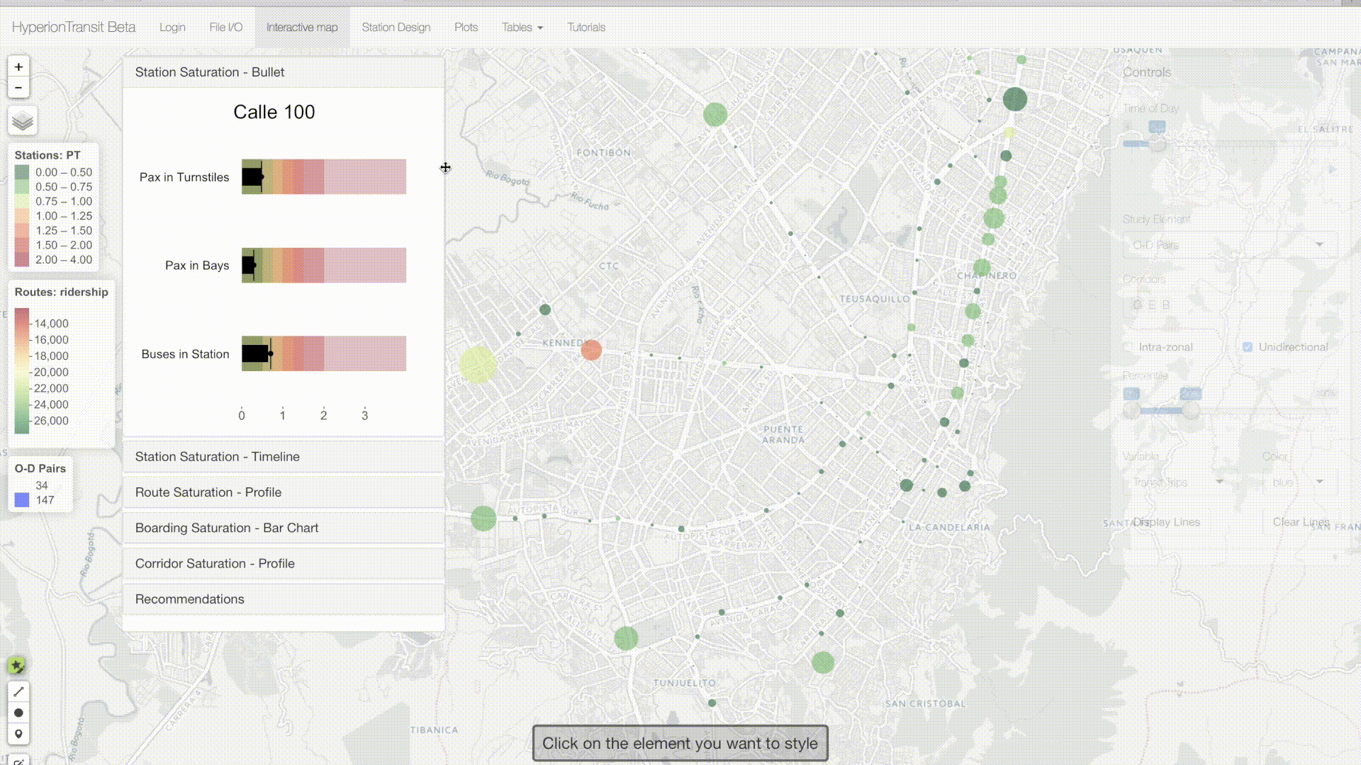
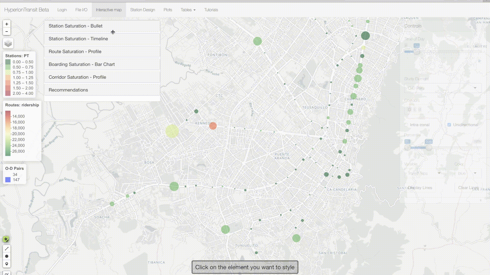
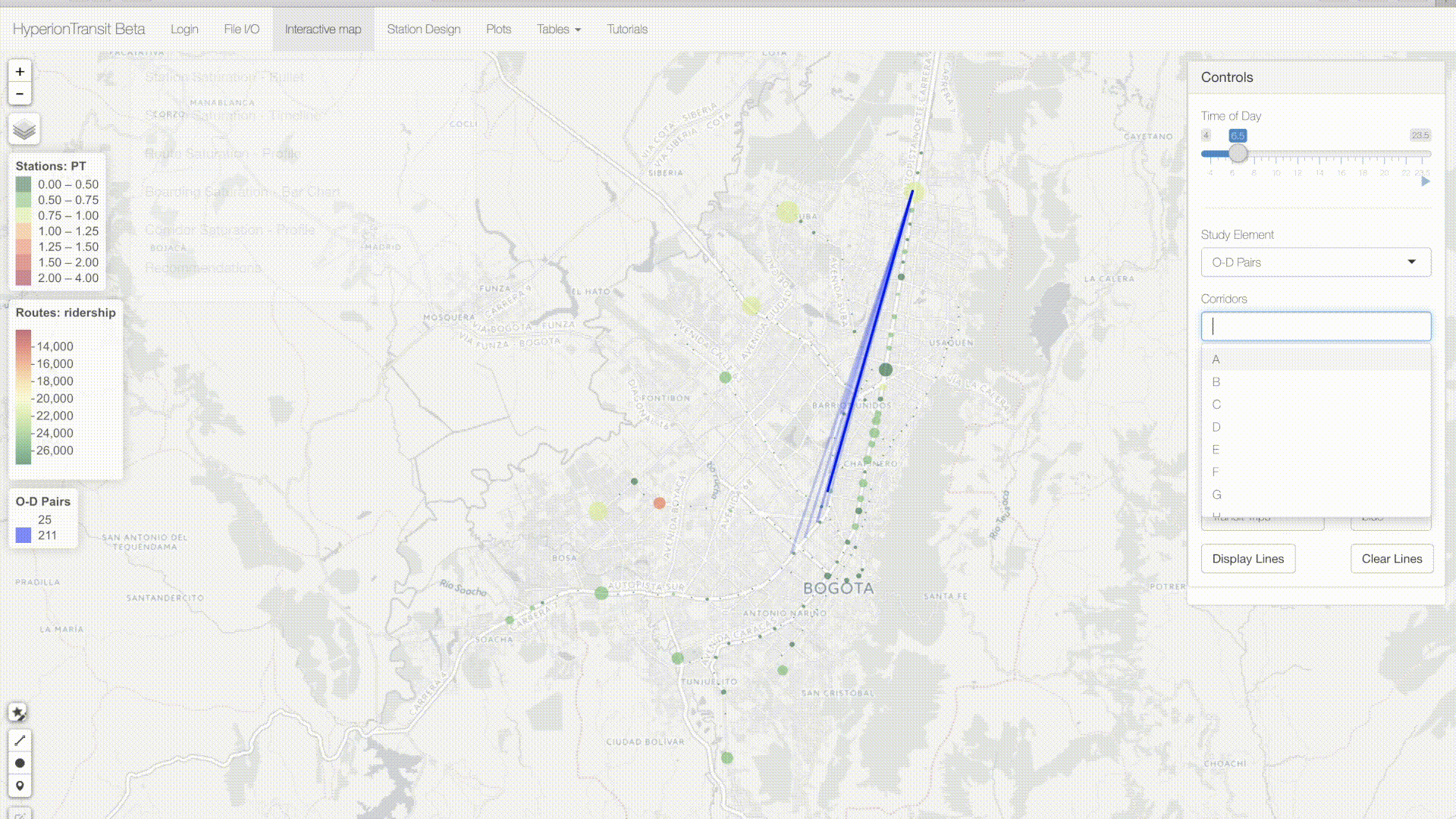
The app’s primary interface features an interactive Leaflet map that visualizes how congestion evolves over the day at several scales. In the control panel on the right, users can select a time of day, choose the unit of analysis (station, corridor, route, segment or origin-destination pair), and set filters. The left panel includes a stack of plots and a table of recommendations based on the congestion levels.
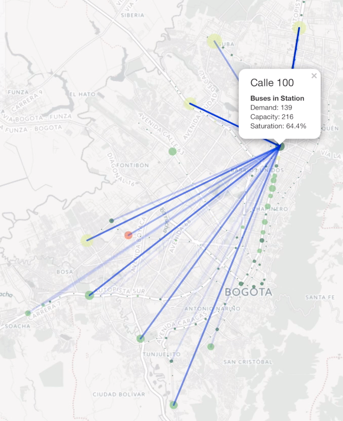
The following gif demonstrates a station-level analysis. The size of the circles is proportional to the number of passengers entering the states within the selected half hour. The color indicates how that level of demand relates to the capacity of the turnstiles at the station entrances. The “bullet” plot on the left shows three types of saturation for Calle 100, one of the busiest stations in Bogotá. The animation shows that, thanks to the recent installation of turnstiles, Transmilenio had relieved congestion that previously caused long queues.
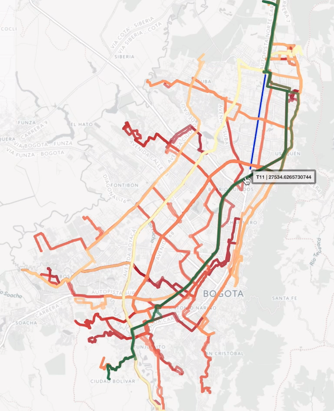
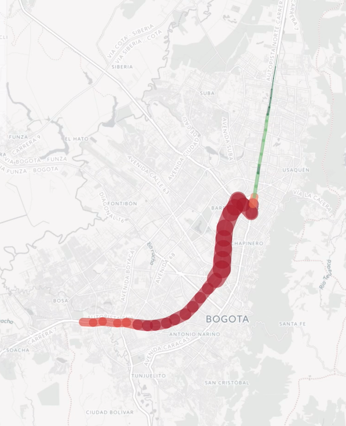
HyperionTransit applies the same theme to visualize saturation at other scales. The screenshot on the left shows the most congested 10% of traditional bus routes, colored according to daily ridership. The center image shows the saturation level of each segment of a route according to Transmilenio’s Emme model. The spider map on the right shows desire lines indicating the destinations of passengers entering the system at Calle 100.
 |
 |
 |
The following gif previews the dynamic plots available on the left panel. Plots of demand profiles over the course of the day and the trajectory of routes are familiar to transit planners. The final recommendations table, however, is product of the original framework I developed for Transmilenio’s 5-year station upgrade plan.
One of HyperionTransit’s most innovative features helps planners design express routes. Users can select a sequence of zones and adjust a filter to reveal station pairs with highest demand, indicated by the weight of desire lines between them.
This project is open-source. Fork Me on GitHub